由于 CSS 对样式的形状调整只能实现矩形、圆形等简单图形效果,如若实现多边形等复杂形状就难的多了。
这篇文章就来介绍 CSS clip-path 属性,来借助 SVG 路径剪切的方式,实现图形路径自由。
这里的菜单效果使用了 framer-motion 配置
clip-path实现 代码
基础
例如: clip-path: circle(60px at 50% 50%);
这里 clip-path: circle(value at x y) 是基本的格式
circle是图形类型,clip-path 支持inset矩形,circle圆形,ellipse椭圆,polygon多边形,pathSVG 路径。value图形类型的值at x y图形的位置坐标
坐标系
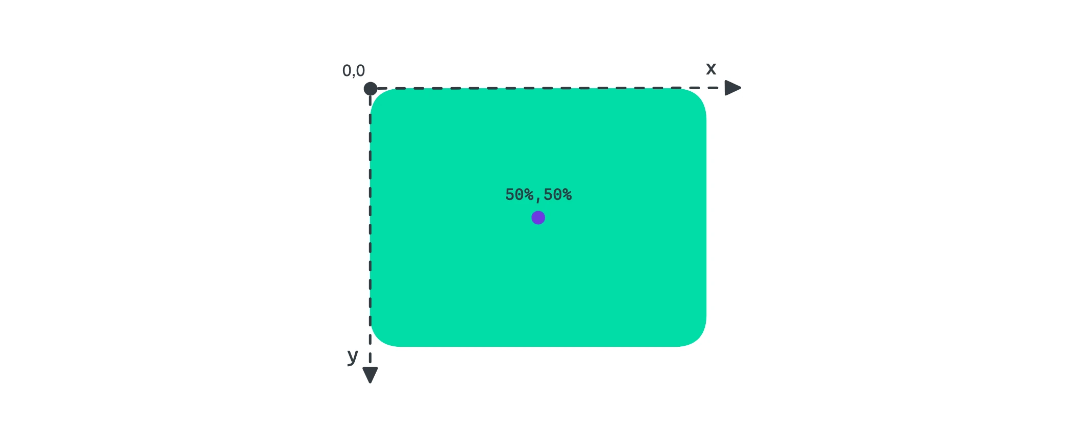
clip-path 的坐标轴是二维的,也就是自由 x 和 y, 整个的坐标轴的中心点在元素的左上角。

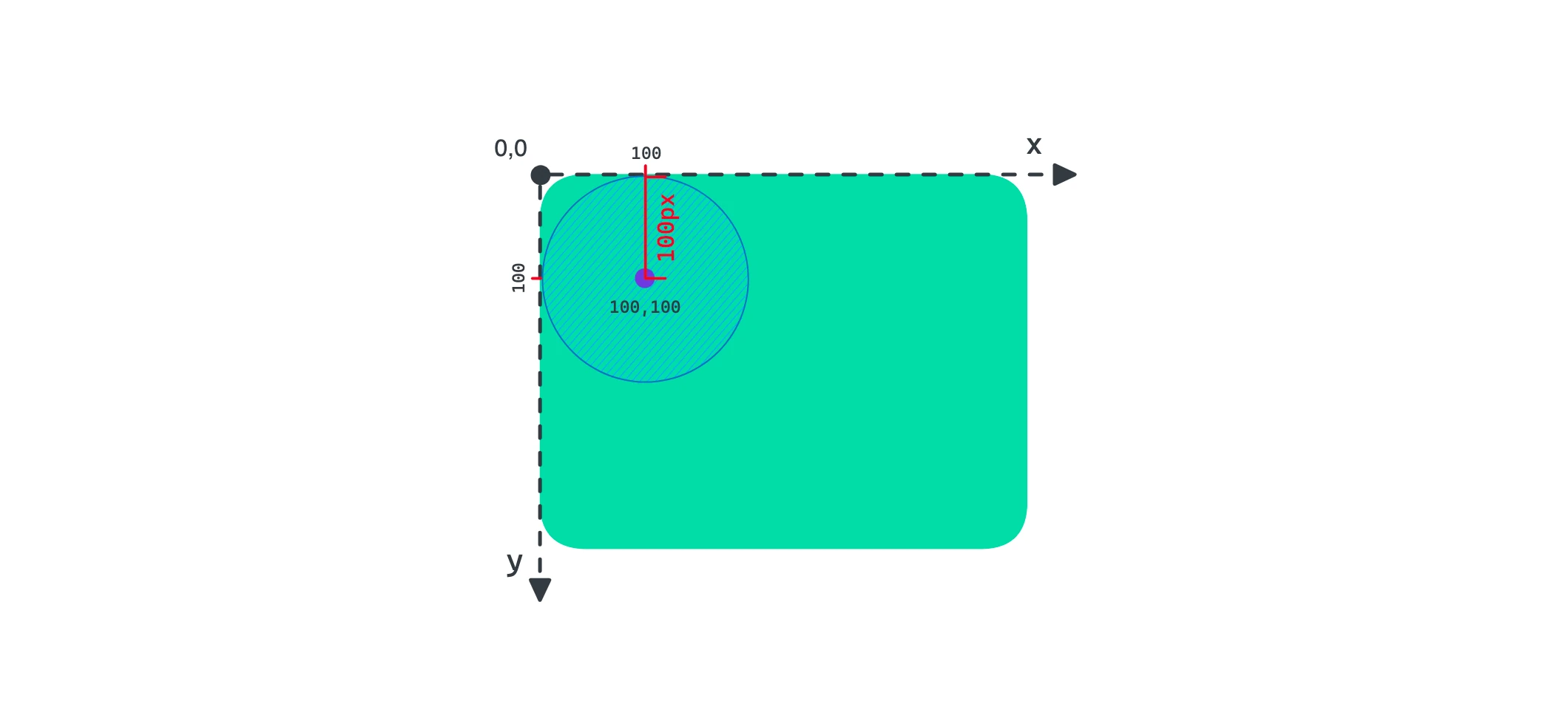
下面的例子是 clip-path 圆形图形,它的坐标是 at 0 0 代表着圆心正好在坐标中心点 0,0 处,而 100px 是图形的值,也就是圆形的半径。
再调整一下圆心的坐标位置,at 100px 100px。
图形类型
inset 矩形
矩形由四条边构成,而这四条边的值有四个,他们分别设置 “上”、“右”、“下” 和 “左” 这和 CSS 盒子模型的边声明是一样的,注意这个值可不是设置边的长度的,这是设置边基于元素的边向内或向外的相对距离的。
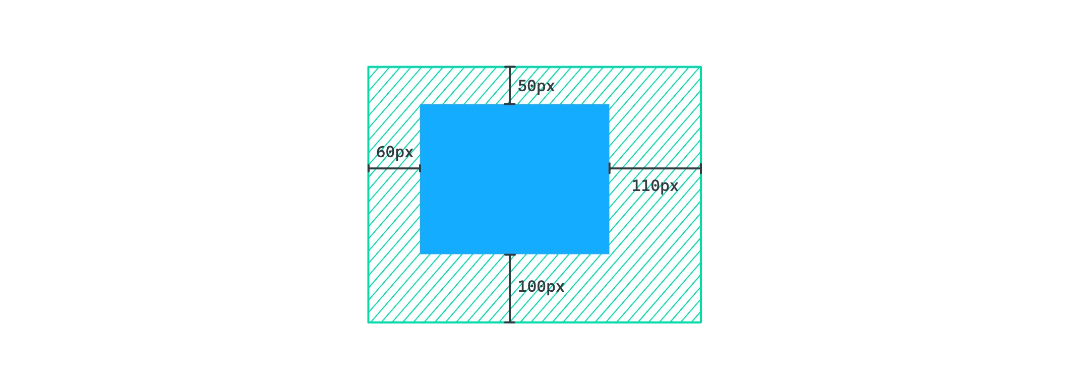
它的声明可以使用简写 50px 50px 50px 50px 可以写成 50px,50px 20px 50px 20px 可以写成 50px 20px。
.card {
	...
	clip-path: inset(50px 110px 100px 60px);
}
矩形可以使用 round 关键字,来声明剪切图形的圆角,而且也是支持简写的,这类似 border-radius 属性。

.card {
	...
	clip-path: inset(50px 110px 100px 60px round 20px);
}
circle 圆形
圆形由半径和圆心点的坐标定义。
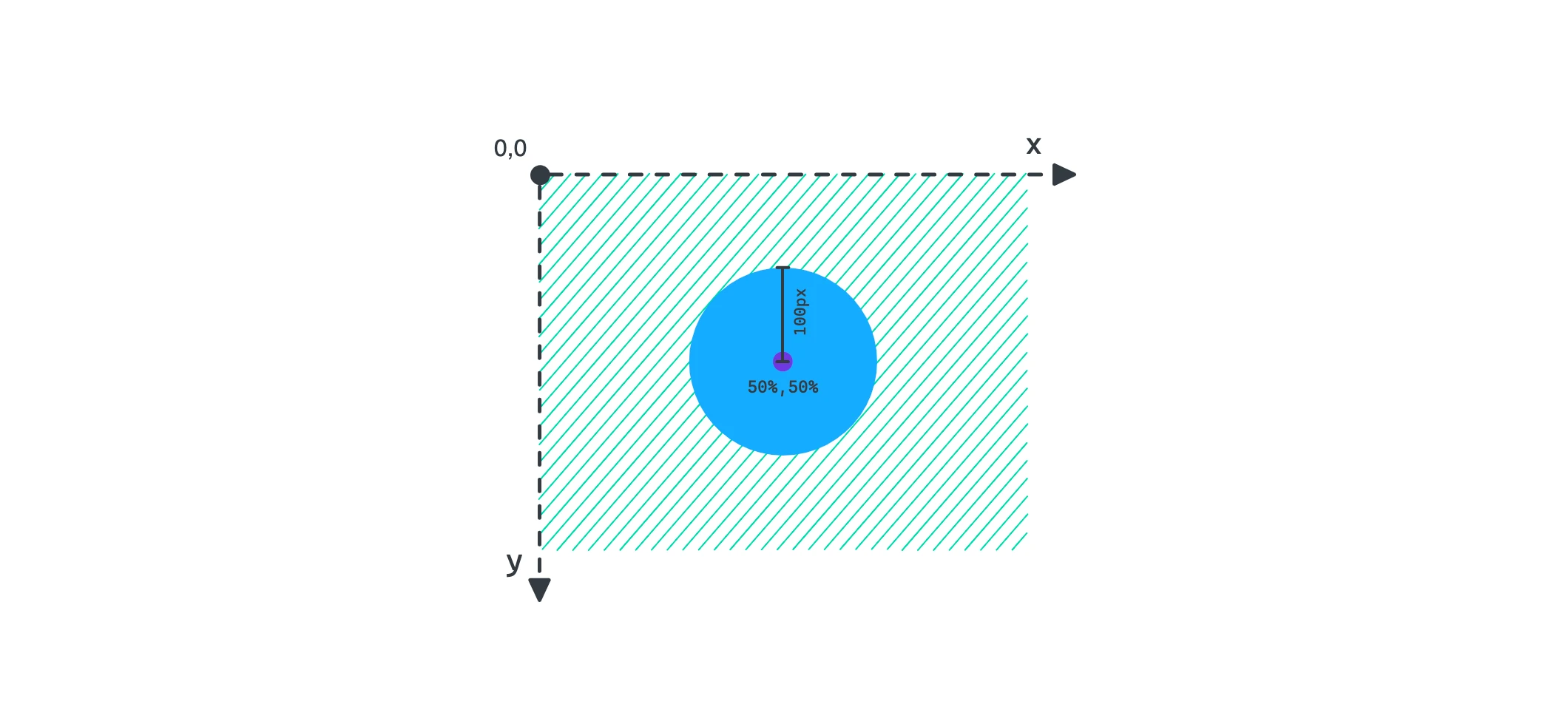
这里定义了半径为 100px 坐标为 at 50% 50%
.card {
	...
	clip-path: circle(100px at 50% 50%);
}
ellipse 椭圆
椭圆由宽高和坐标定义。
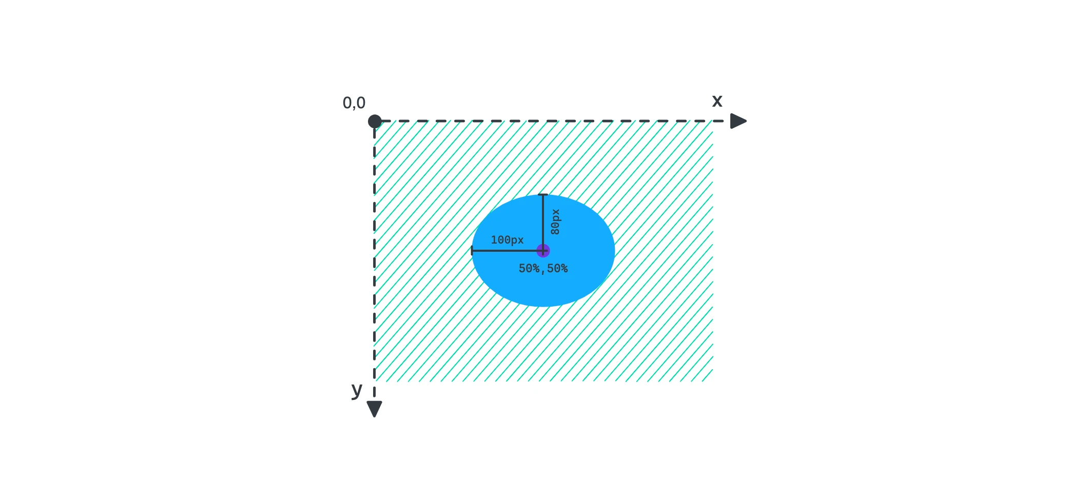
这里定义了宽 100px 高 80px 坐标为 at center 这里 center 就是 50% 50% 的位置关键字
.card {
	...
	clip-path: ellipse(100px 80px at center);
}
polygon 多边形
多边形的构成是有多个点(最少三个点)连接,构成图形,而每个点需要由坐标定义,也就是 x, y。
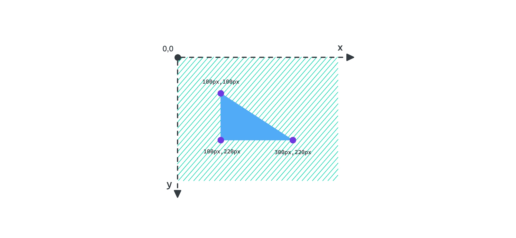
这里定义了三个点 100px 100px, 300px 220px, 100px, 220px ,clip-path 会按书写的顺序连接点位,闭合(首尾点位相连)后构成图形。
.card {
	...
	clip-path: polygon(100px 100px, 300px 220px, 100px 220px);
}
path SVG 路径
SVG 路径允许我们使用 SVG 来定义元素,这可方便多了
使用内联 SVG 来定义,它们使用 SVG 的 id 来关联
<svg>
  <defs>
    <clipPath id="triangle">
      <path d="M0 196V0l301 196H0Z" />
    </clipPath>
  </defs>
</svg>
.card {
  clip-path: url("#triangle");
}
也可以直接设置 path
.card {
  clip-path: path("M0 196V0l301 196H0Z");
}

案例
文本环绕
要实现文本环绕需要使用 shape-outside 属性,不要担心,它和 clip-path 是类似的。
.picture {
  float: left;
  clip-path: circle(186px at 0 0);
  shape-outside: circle(196px at 0 0);
}
这三行代码是核心,可以看到使用了 flaot 属性,表示图片是要浮动的, shape-outside 的园半径是比 clip-path 大些,是为了留开间距,实际 shape-outside 是支持盒模型设置的。
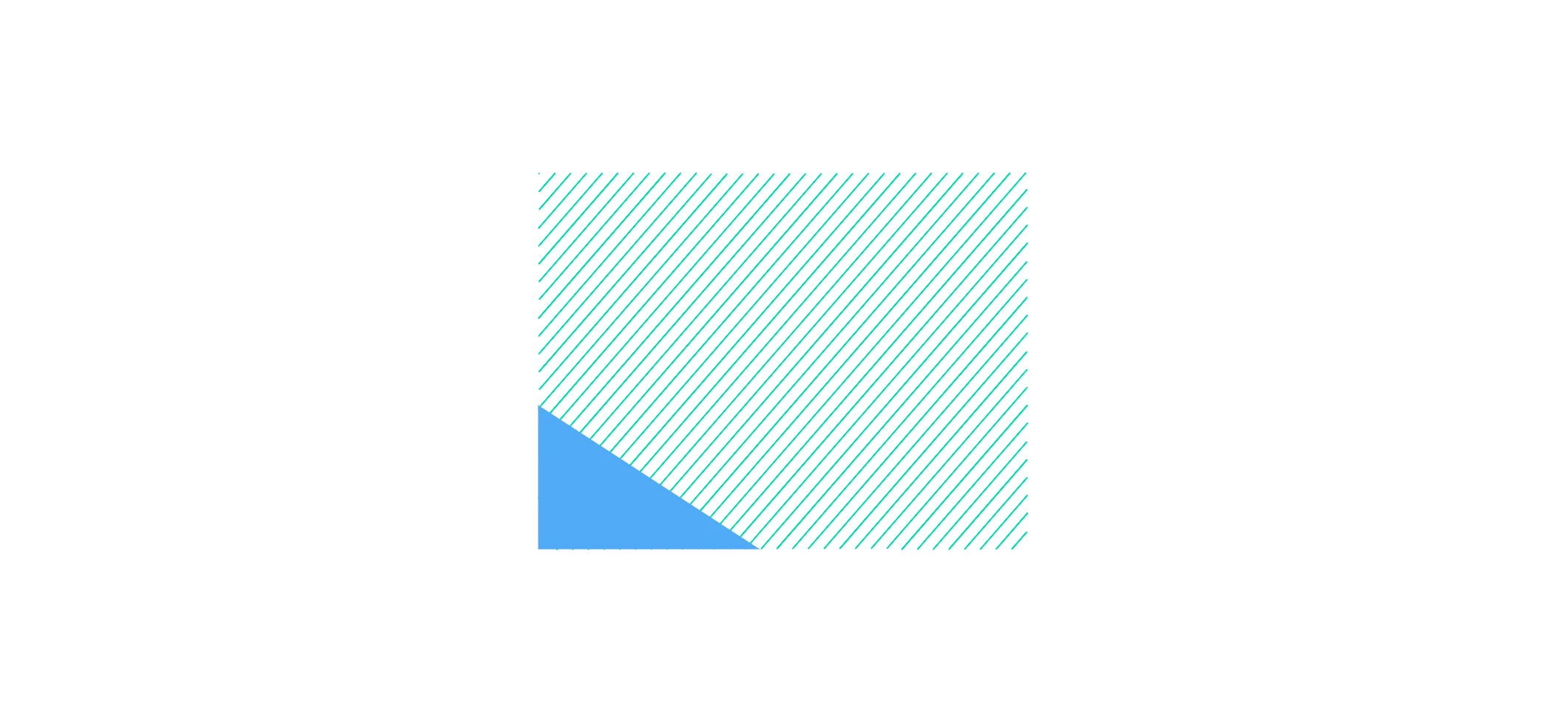
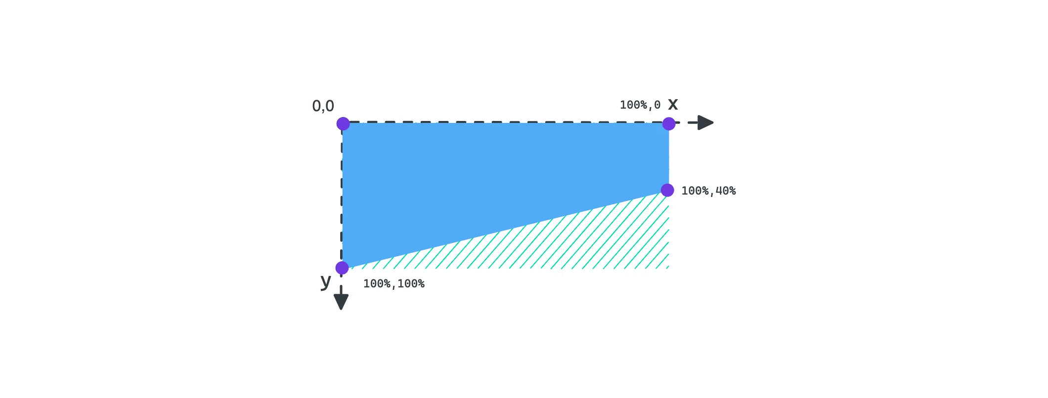
背景斜切
使用 cli-path 实现斜切背景效果是很容易的,我们使用 polygon 来处理,为什么不使用 path 搭配 SVG 呢?使用 polygon 点的位置可以使用百分比,这可以实现响应式,如果 SVG 的话,位置很难把控。
.hero {
  ...
  height: 400px;
  background: #00a6fb;
  position: relative;
}

.hero::after {
  content: "";
  position: absolute;
  left: 0;
  right: 0;
  top: 100%;
  z-index: 1;
  width: 100%;
	height: 80px;
  background: #00a6fb;
  clip-path: polygon(0 0, 100% 0, 100% 40%, 0 100%);
}
动效 - 卡片的背景剪切
💡 请将鼠标移入卡片。 动画的过渡是支持 clip-path 的, 这里需要设置为 all
.card-bg {
  clip-path: circle(20% at -10% 50%);
  transition: all ease-in 1s;
}

// hover
.card-bg {
  clip-path: circle(150% at 0 0);
}
TailwindCSS
在 tailwindCSS 使用 clip-path 需要自定义 @layer tailwind 是没有该属性的配置的。
@layer utilities {
  .wave-clip {
    clip-path: url(#wave);
  }
}